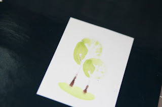
Hands down these copic markers are amazing. But they are spendy... Worth every penny. Don't let the cost hold you back. You can still use them if you are in the building mode and only have a few markers.
There is no question that the more shades you put in an image to blend in, the deeper your image becomes. But that does not mean that if you have fewer shades you cannot create something beautiful that still surpasses "regular" markers, even if it doesn't look the same as a multi-copic-shaded blended image.
I've written before about how when you go over your dried copic color with the same marker, it darkens the color by about 1/2 color value. You can use that effect for a 1 pen shading.
Here, I am using a stamp from the August 2009 kit of the month from Unity Stamp Company Following my Heart- stamped with memento ink on simply smooth cardstock and COPIC YG03. (As an aside - this cardstock is a DREAM... My results with my copics on this paper surpasses everything else I've tried. I highly recommend it.) When I color with my copics, because the saturation can stain what's underneath, I color over a page ripped from an old magazine, to protect my mat.
I have my light source coming in from the top left of the picture, so the bottom right would be the darkest in terms of shading. Color that part of the image first. REALLY color it - go over and over and over so that your paper is VERY saturated.
Your back side of the image should look something like this - see how solid the saturation is?
Next, using a light hand, color the balance of your image from left to right. Keep your hand light here because you want an even but single layer of color. When you get to the area where you laid the color down before, start to use your small circular motions to blend the seams, and continue and add another layer of color over your previous dark side to darken it even more.
The backside should look something like this. Sorry, this picture came out a little blurry. But you can see the solid color on the left and barely on the right.
To me, it still looked a little flat, and so I took my marker again and drew a very fine line outlining the left side of the tree, and then went to the bottom right and did that 2-3 times. Now, it looks a little deeper. I also colored the rest of the image using the same technique.
and here's my finished card - using PRIMA's Mommy and Me line
Enjoy.


No comments:
Post a Comment